 How often has this happened: you click on something you didn’t actually want to see (maybe because you were trying to scroll with your finger), causing an image to fill the screen obscuring whatever you were actually trying to read. Instinctively you hit the ‘back’ button to get back to whatever you were trying to look at.
And…you’ve lost everything. You’re somewhere else completely. You go back to the page you were on before Facebook. Annoyed, you try to go forward again, but you’re looking at an entirely different post. You scroll down, but the post you were reading is nowhere to be seen. What happened?
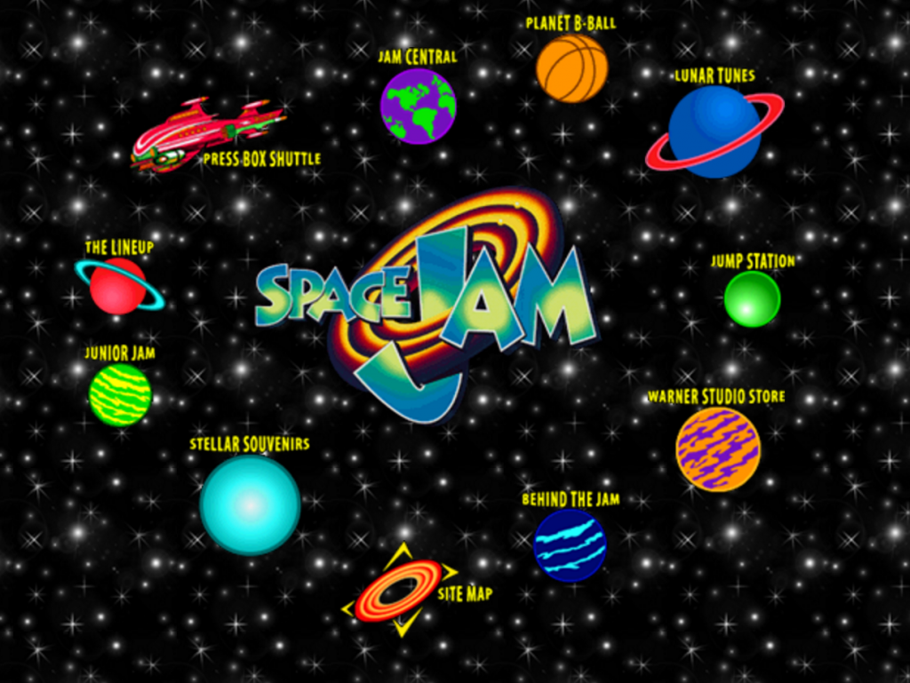
Let’s go back a few years, like maybe 15. I was making websites back in the days when dinosaurs roamed the web. Modern developers, in the middle of fighting over whether to use React or Angular2, might entertain themselves looking at this list of old 15-20 year websites moldering on servers that nobody ever bothered to update or shut down. They laid things out with tables. Tables!
If that doesn’t mean anything to you, let me explain. Back in the day, when you got a Photoshop mockup from a designer, the first thing you’d do is chop it up into little boxes, export them from Photoshop as jpegs or gifs (no pngs or svgs in those days). Then you’d use the HTML <table> feature to plan the page out in rows and columns. This was a hack; the tables tag was made to create, well, tables, like rows and columns with headers. But before browsers had consistent and reliable stylesheets, it was the only certain way to always get the layout you were looking for.

But in the middle of laughing at the silly old animated gif backgrounds, you might notice something, as for example on this page for Dole Kemp ’96: before the page even finishes loading everything is in exactly the right place, even before any of the images loaded. And after it loads everything stays exactly where it’s supposed to.
There’s a reason for that. Back then, instead of using styles, every image had a HEIGHT and WIDTH attribute (yeah, back then some people capitalized their HTML too). In the days of 56k dial-up modems, every kilobyte that went over the was precious, so you exported the images at the precise right size and then set that through the attributes in a table.
Compare that to many framework-driven applications today, especially when you’re loading them on a phone. You’ll be in the middle of reading a paragraph, and it will jump 300-400 pixels above and below you. The Talking Points Memo site for example (whose content I love, by the way), is terrible at this; when I read it on my phone I feel I’m chasing the content all over the page.
Nobody uses tables to build pages anymore (except Visual Studio’s .NET templates, because Microsoft). Now people declare the size of their images using stylesheets, if they even bother. When they do it’s probably done dynamically, sometimes by resizing on the fly using Javascript.
Now let’s get back to the lost Facebook post you meant to read, and lost when you hit ‘back.’
Back in the primitive days of the Web, the back button was a reliable thing. It took you back to whatever you were looking at last. Sure sleazy advertisers could try to override it with Javascript, but you learned to avoid those sites.
But the back button won’t get you back to what you were looking at now. Why didn’t it just close the image and go back to the post you were reading? Because the image you were looking at is actually the same url that you were reading before (because Facebook is what developers today call a ‘single page application’). There was actually some little ‘x’ in the upper right hand corner of the screen that would have closed the image and allowed you to read what you were reading, but you didn’t see it.

Now it’s too late, because you went off Facebook. When you tried to go back, in the continuously loading application the particular post you were reading is far down the feed. Facebook has loaded twenty or forty new posts in the time you were away; there’s no way to know how far you’ll have to scroll to get back to where you were. And because of Facebook’s constantly shifting algorithm weighing what should and shouldn’t be shown, it might be gone altogether. You may never even get a chance to like your friend’s cat pictures or make an angry face in sympathy to her political rant.
But it has to be that way, say the developers as they look up from their scrambling efforts to learn whatever Javascript framework displaced the one they were using last year. It’s Web 2.0! Anyways, why don’t you just get the app?
Listen: whenever engineers tell you ‘it has to be that way,’ they are failing at their job. There is no technical impediment to making a web that works the way people expect it to. Instead of fighting over what Javascript superset to transpile from, maybe we should be talking about that. Let’s start with making pages that stay in place while people read them, and making pages where the ‘back’ button does what it’s supposed to.