I’ve been thinking about teaching HTML/JavaScript lately and why I don’t do it. One of the main reasons is that front-end as it’s done today is much harder than learning a language like Python or Java or C. This will surprise you if you’re a developer who fell into a Rip Van Winkle type sleep in about 2002.
It used to be that making the “front end” of a web page (basically HTML + stylesheets + JavaScript) was a great way to get started learning to code. After all, you could start with something like this:
<html>
<body>
Hello world!
</body>
</html>
And hey, open that code up in a browser and it will still work! The difference is that in those days, every single element or file you added, no matter how complicated it was, was written by your own hand. You never looked at your file structure and said “what the hell is all this stuff for?” (At least, not if you recently wrote it.) And you could use code that you entirely wrote by hand for professional -level production! Sure, you could by using FrontPage or DreamWeaver, but even then if you spent a little time you’d understand what the code they put in was for.
And if you wanted to see how it was done, you could just go on the web and hit “show source.” You could read everything that made a web page do what it does, and if you spent enough time you could understand it.
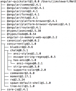
Nowadays, however, professional-level front-end almost always involves some kind of “framework.” The definition of a framework is kind of hazy, but I’m going to use a broad definition that includes everything from Angular to Ruby on Rails to .Net to React, knowing very well that those don’t really go in the same category. What many of them have in common is that there is a moment of instantiation where some huge file structure is automagically constructed for you. It will usually create something like this:

And that’s just the top tenth or so of it. Note that depending on the “framework” (again using that term very loosely) your file structure there could include a lot of backend stuff too, for example in Ruby or .Net.
So someone set all this stuff up to make it easier for you, right? No way you were going to make all those files. But here’s the problem: now you have a digital house of cards where if you screw up just the wrong thing the whole thing comes crashing down and stops working.
But, I mean, you can’t just leave it alone either unless you want to publish a page that says “Welcome to [framework]! Click here for a tutorial to make your page.” Presumably you started this whole process because you want to make a website with some content.
So a lot of the time you spend is learning what small tiny fraction of these files it’s (sort of) safe to screw with. And you may work with this framework for a very long time before you know what most of those files ever do. I’ve been doing .Net long enough to at least know what most of the files in an MVC file structure do. But sooner or later they’re going to change the whole framework and everything will be confusing again. If you don’t believe me as anyone who learned Angular 1.
And things get worse when you need to use more than one of these frameworks at the same time, as often you do. If you think that a .Net or an Angular framework alone are confusing, try to figure out how to shuffle these two houses of cards into a single house that still stands.
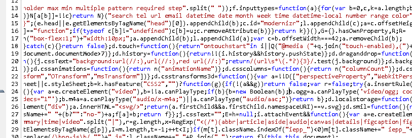
And forget seeing how someone else does something. Most professional javascript today goes through a minifier, Now if you try to read someone’s script you’ll see something like this:

Good luck trying to figure out how that works!
Of course you could still teach people to make a website the old-fashioned way. But the question is, is it worth it? Might it be that the baroque intricacies of cascading stylesheets will become as distant to users in the future as pointer-level memory management is to most people that use languages like Java or Python?
Not sure what to do about this. What people want from a web app nowadays requires these frameworks. But it’s sad to think of how it’s changed.
 How often has this happened: you click on something you didn’t actually want to see (maybe because you were trying to scroll with your finger), causing an image to fill the screen obscuring whatever you were actually trying to read. Instinctively you hit the ‘back’ button to get back to whatever you were trying to look at.
